
Existing user? Sign in
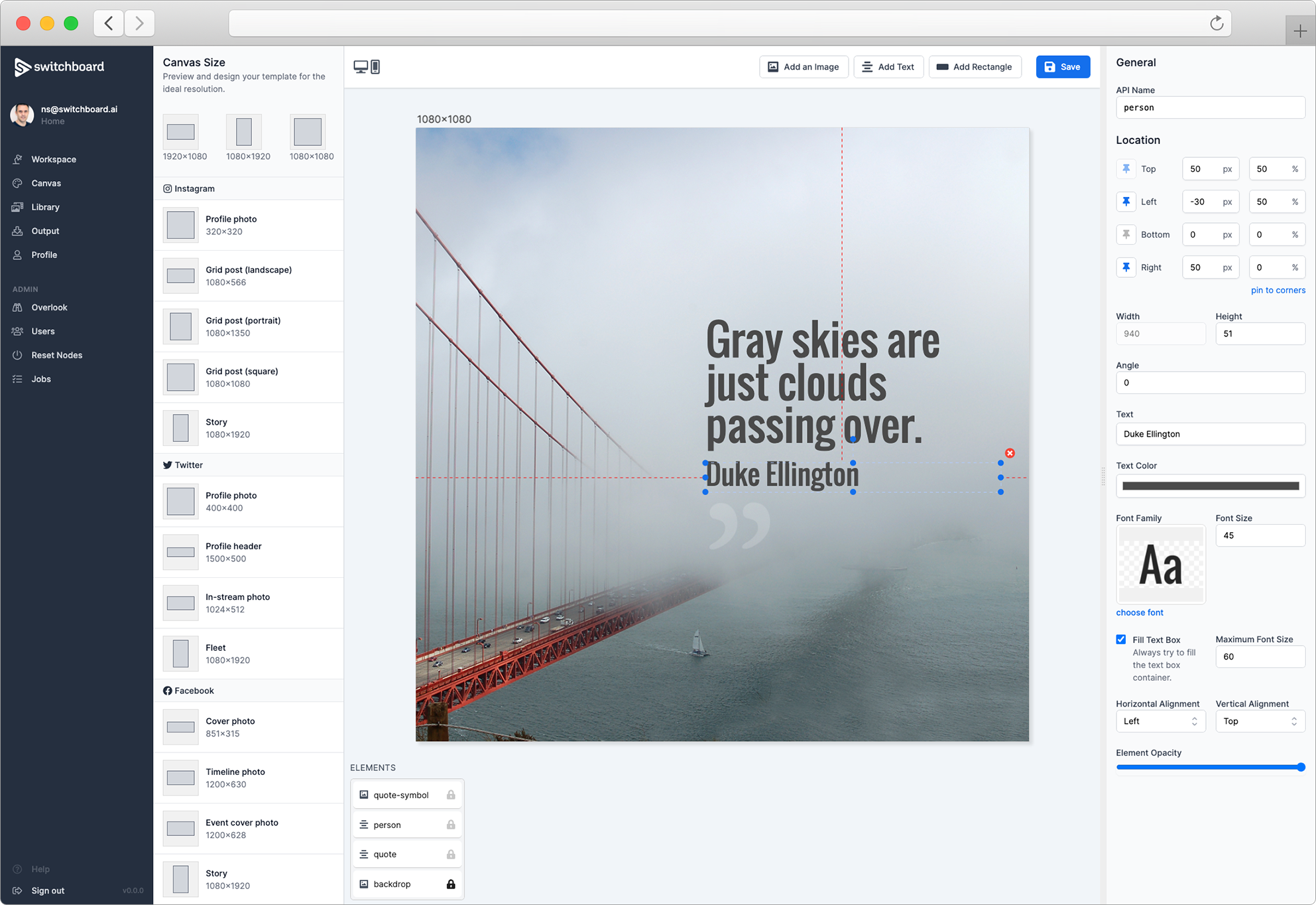
With Switchboard Canvas, you can design templates in the web-based editor and generate images from your templates via the API. With the API, you can provide substitute values so that your images become dynamic and can be targeted from any platform that can call a REST service.
This help guide will cover using the web-based, responsive template designer.
We’ve included 2 templates that you can use to see how the template works. The Twitter template can be used to create an image of a tweet.
Elements are the objects you place on the editor and configure. Switchboard Canvas currently supports images, text and rectangles. Each has their own configurable properties.
The Image element places an image on the editor at the location and size you specify. In the editor, you choose an image from your Library, but when calling the template from the API, you can override this value with an image at a given URL. Using images from your Library means you can preview more accurately what your generated images will look like.
Any images not overridden via the API will use what you configure in the editor. This means you can upload any consistent branding to your Library, but only override values you want to change when using the API.
The Text element adds text to the editor at the location you specify. The Text element by default tries to fit the text to the bounding box by intelligently resizing it. You can choose both horizontal and vertical alignments and set a maximum font size so that your text never gets bigger than you’d like at certain resolutions.
The Rectangle element is the simplest element and adds a solid block of color to the template. You can choose the angle, color and the opacity of the element with the Rectangle properties. You can also give the rectangle rounded corners using the Corner Radius control.
Use the previewer icon to view your template at different resolutions. A number of standard resolutions are included based on social media post and image types.
Selecting a new resolution re-organizes the elements in the editor based on their location, size and pin settings. Part of the power of the Switchboard Canvas template editor is the ability to pin elements to the boundaries of the design so that they stay in position and resize as you expect when resizing.
When a design includes a series of correctly pinned elements, you can make a single API call to generate a number of different sized images from the same template.
Pinning gives you the power to finely tune the location and size of the elements in your design when the resolution changes, i.e. when you request a different sized version of your template via the API.
At a high level, you can pin the top, left, bottom and right edges of an element to the respective boundary of the design, and then offset the distance from the edge by either an absolute value, in pixels, or a percentage. The percentage refers to the template’s height on the Y-axis or the width on the X-axis.
For example, to add a rectangle that always covers the bottom right corner, regardless of template size, we’d take the following steps: 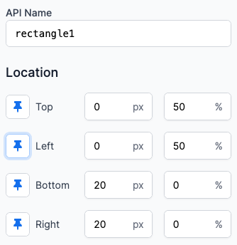
This will produce the following result at 1920x1080: 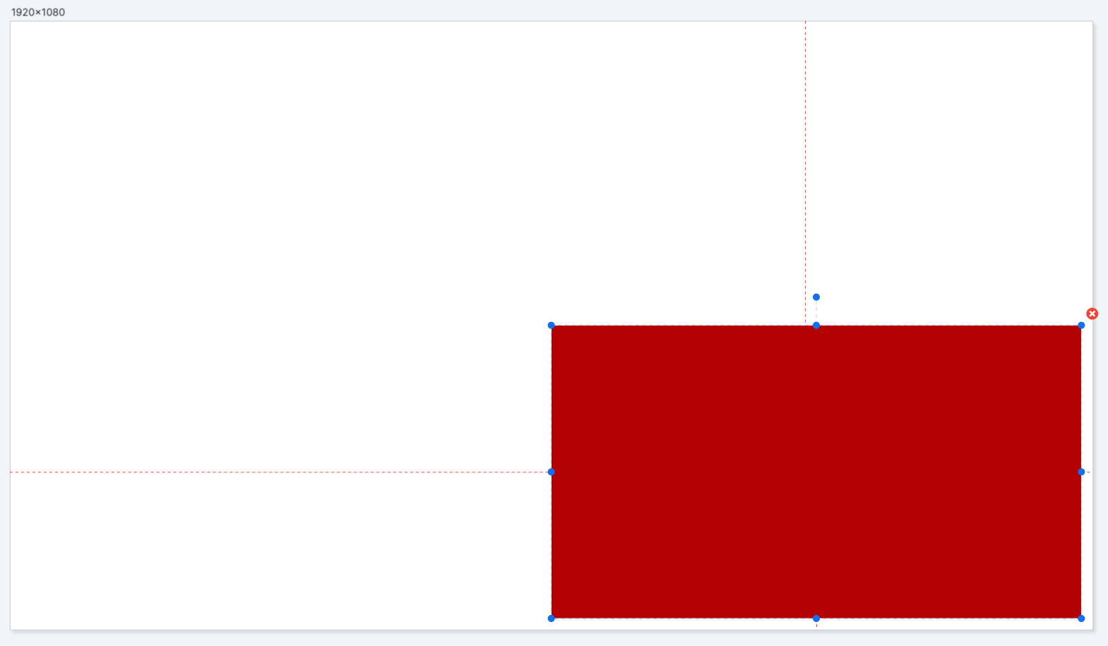
And at 1080x1080: 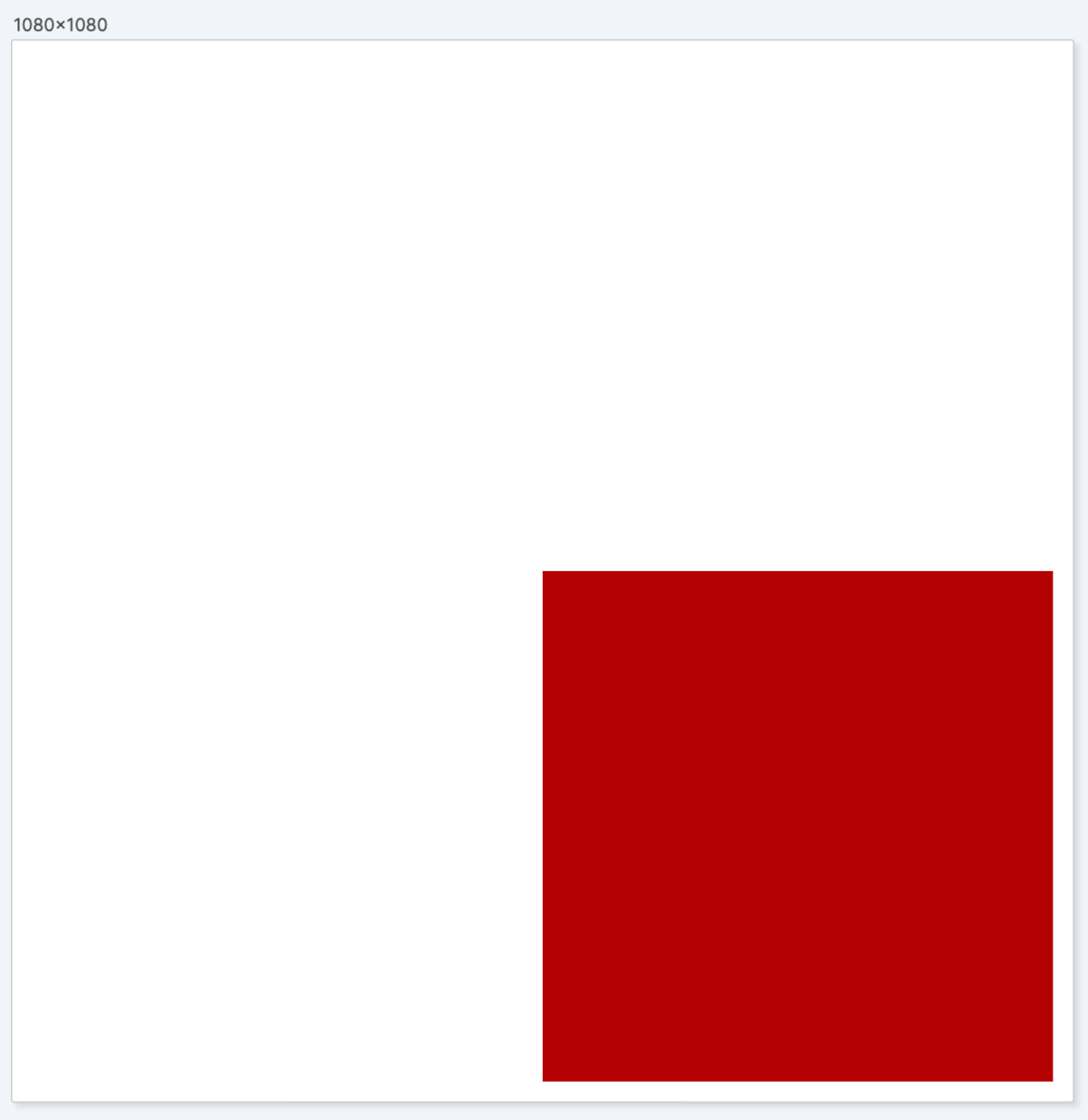
When certain edges are enabled for pinning, the Width and Height properties are calculated automatically and become read-only. If you know you always want to keep an element a fixed size, you can disable pinning on the Bottom and Right edges and enter the width and height manually.
All three elements support rotation in the editor.
When a pinned object is rotated, Switchboard Canvas aims to keep the element within the pinned bounds, resizing as necessary. This example shows a rectangle that is pinned to the four edges (with a padding of 20px). The rectangle has also been rotated 10 degrees. 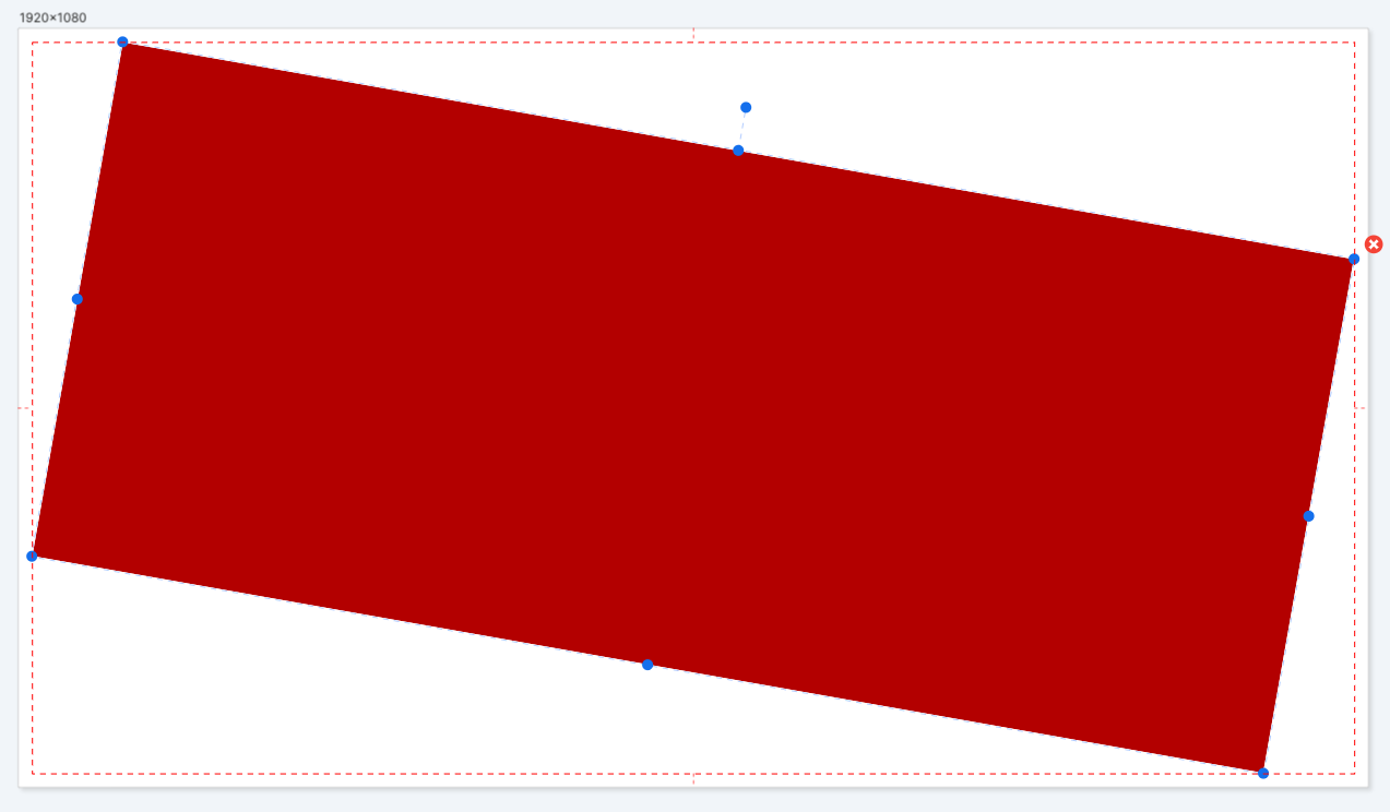
As the angle increases, the size of the rotated element is reduced. This is the same rectangle at 24 degrees. 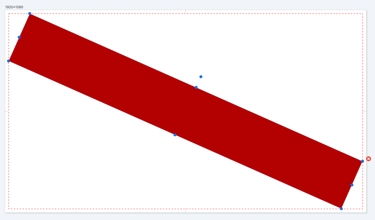
Based on the resolution of the template, there will be a maximum angle that can feasibly show the rotated object, and values above the maximum angle will be reset to zero.
Image request via the API that include out of range values for rotation will still be generated but the response will include a warning.
Every element in a template, including the template itself, has an API name which is referred to when using the API. This is a unique name that identifies the template.
The template also has a background color and a control for background opacity. Setting the background opacity to 0 makes it transparent when images are generated.
Toggle Element Clipping This toggle controls whether objects positioned either partially or completely outside the editor’s bounds are visible or not. You can create interesting effects by having certain elements partially visible so this control is useful when previewing your designs.
Add an image to your template by clicking the Add Image button at the top of the editor. A placeholder image is used by default, so click ‘choose an image’ in the Image properties panel to select an image from your Library.
Pasting an image Additionally, you can also paste an image from the clipboard directly into the editor. You’ll be informed that the image will be uploaded to your Library, so click Yes to agree or No to cancel the operation.
Location See the Pinning section for complete information on specifying the location and size of your image.
Angle Angle is the rotation of the image in degrees. When pinned images are rotated, the bounding box is pinned according to your settings and the image rotates inside it.
Corner Radius You can give the image rounded corners by increasing the Corner Radius value. At its maximum value, a square image will be appear circular. 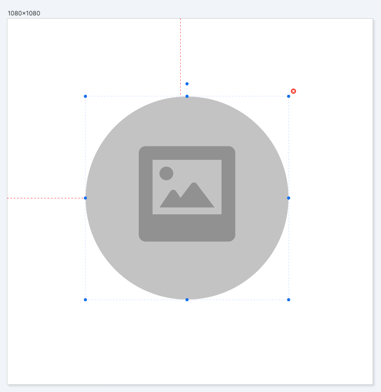
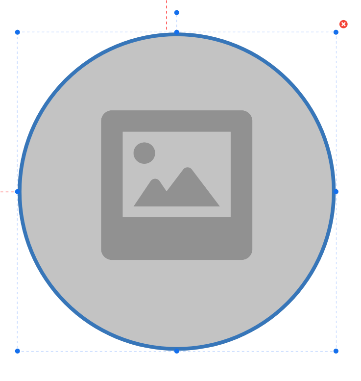
Stroke Color & Stroke Width You can add a border to the image by choosing a stroke color and width. 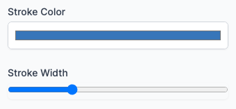
Sizing & Alignment Switchboard Canvas features a number of properties to help you size and position your image correctly. 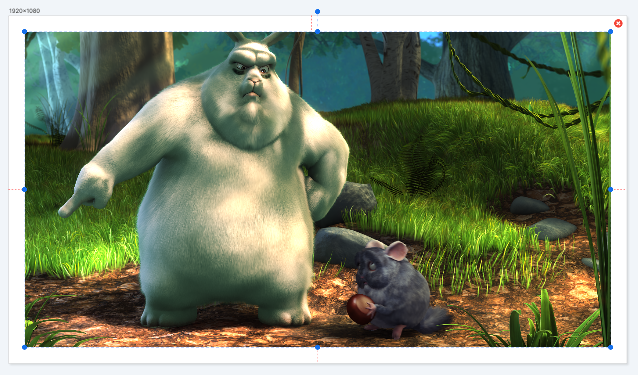
By default the image will fill the bounding box based on the width and height (or any pin properties). This example shows a 1920x1080 image covering half of the template as its Right property is set to 50%. When the bounding box is smaller than the image, the image by default is cropped, filling one dimension and centering along the other: 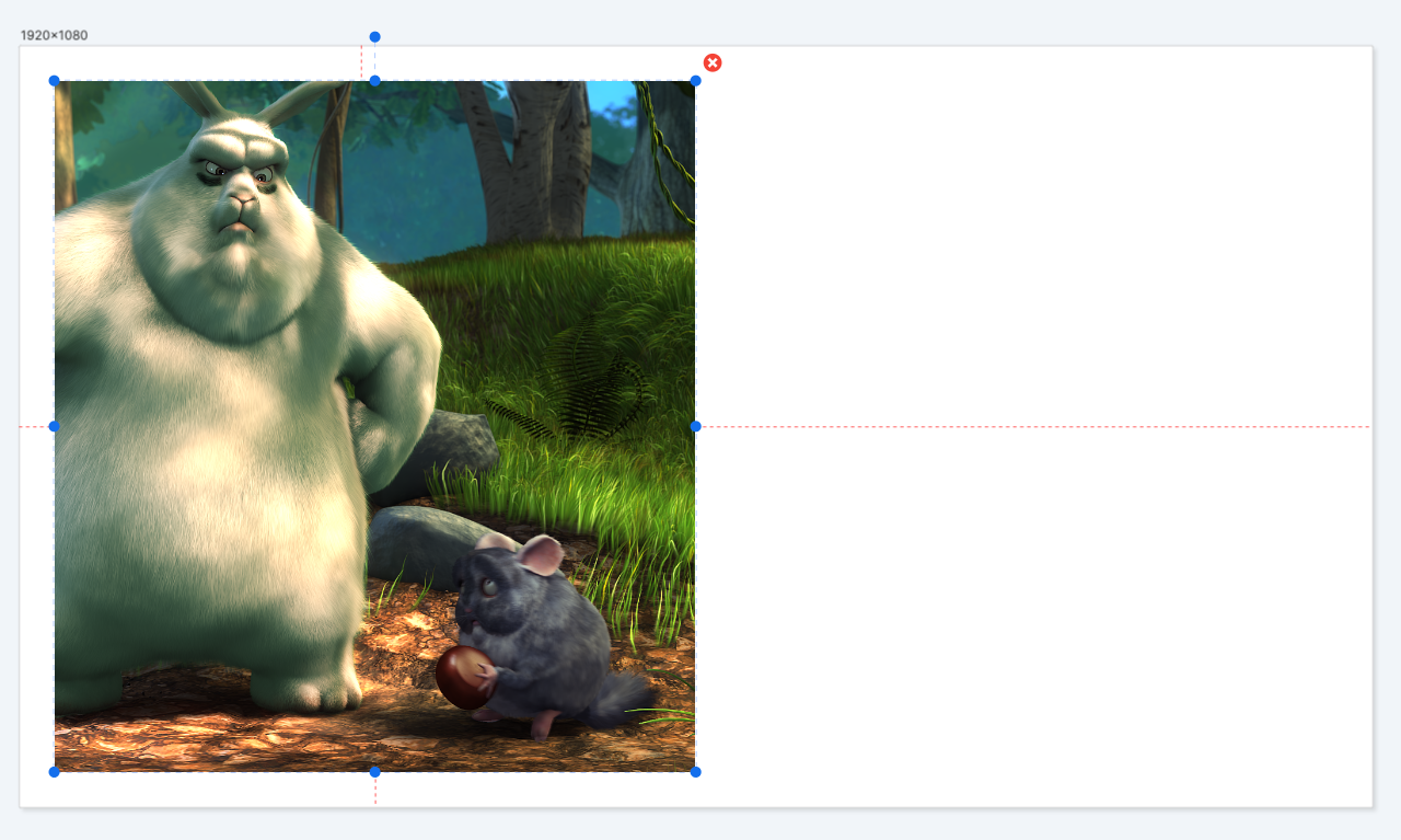
You can adjust the horizontal and vertical alignment to view the idea portion of the image. In this case, the horizontal alignment is set to Left: 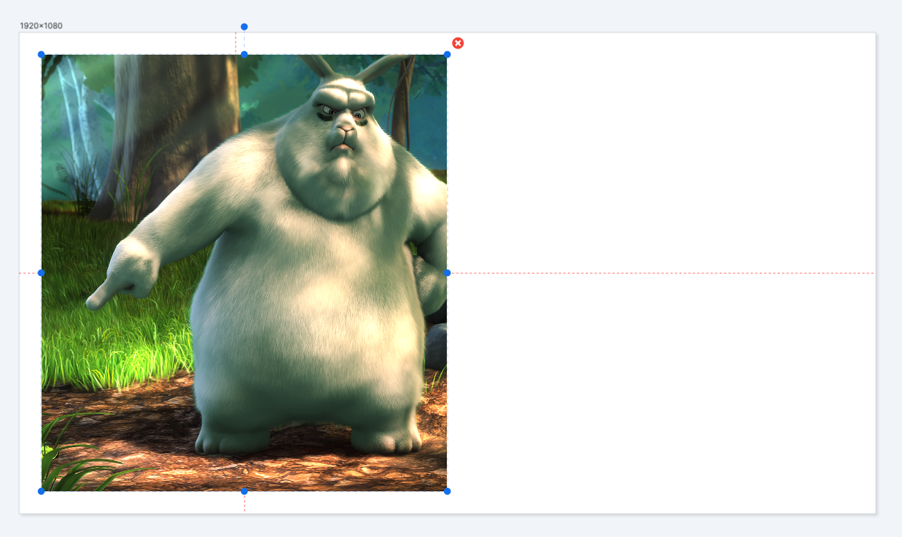
Instead of having the image fill the bounding box, you can have it be contained within the bounding box. Check the Contain image in bounding box check-box: 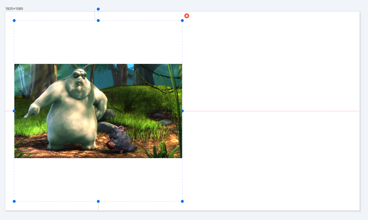
You can also specify a background color and background opacity for when images are contained within their bounding boxes: 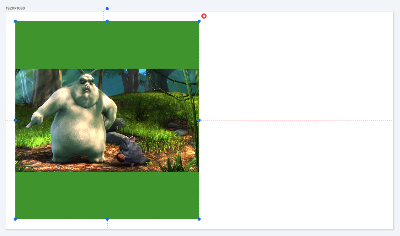
You can add text to your template by clicking the Add Text button at the top of the screen.
Text can be specified in the template designer, and also overridden when generating images via the API. The Text element is very flexible and allows precise control of how images are rendered when the text is dynamic.
As with the other elements, the Text element can be position and pinned to the template’s edges.
By default, the text in the Text element fits the bounding box. This example shows a Text element that’s pinned to all four edges, 25% of the width from the left and right edge, and 25% of the height from the top and bottom edge: 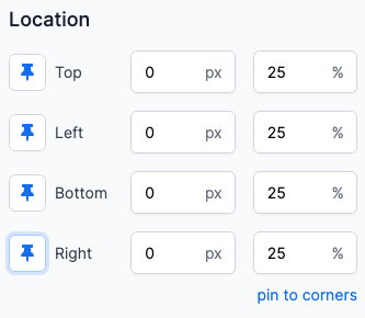
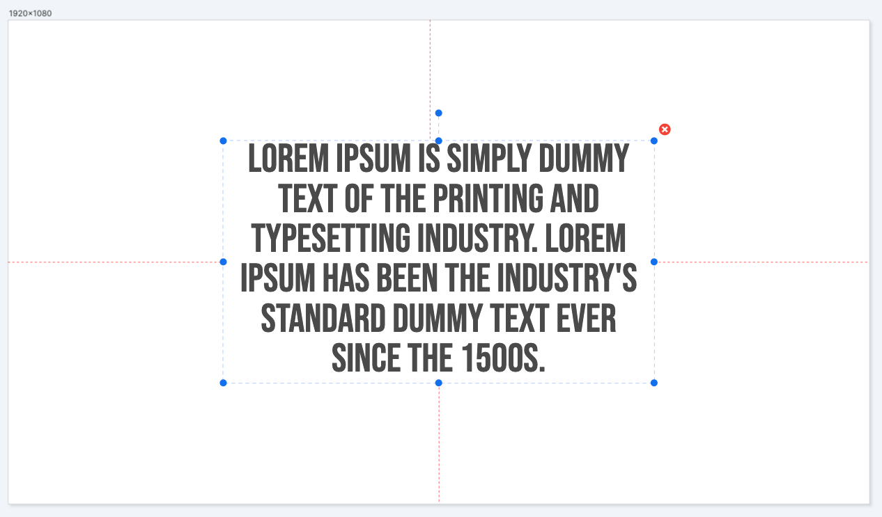
If we alter the text, the size of the text alters to fill the bounding box: 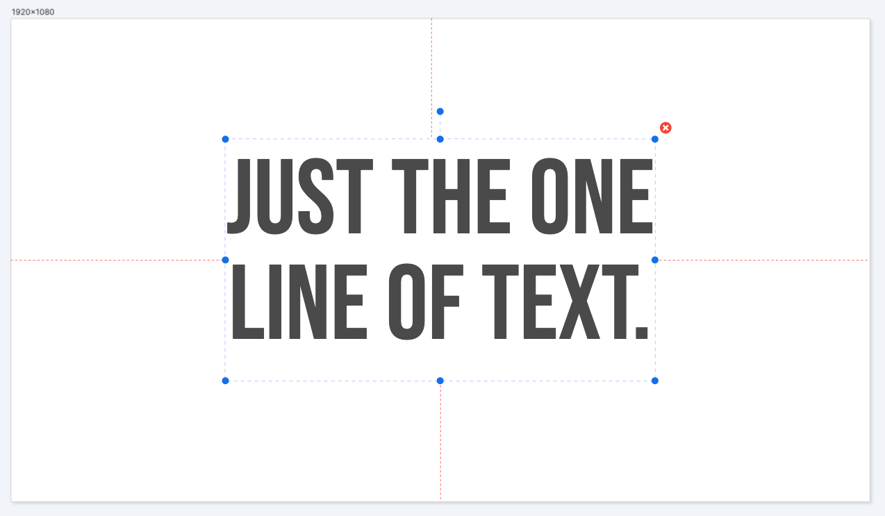
**Maximum Font Size ** Changing the maximum font size gives the font a maximum size when trying to fill the bounding box. This prevents the text being too large in certain resolutions: 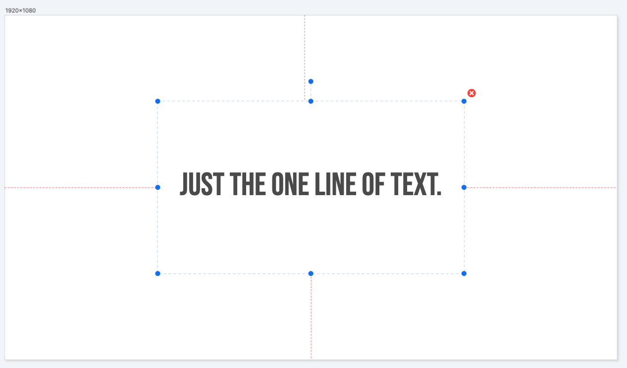
Alignment When the text does not fill the bounding box, by default it is centered horizontally and vertically. You can override this behavior by specifying horizontal and vertical alignments: 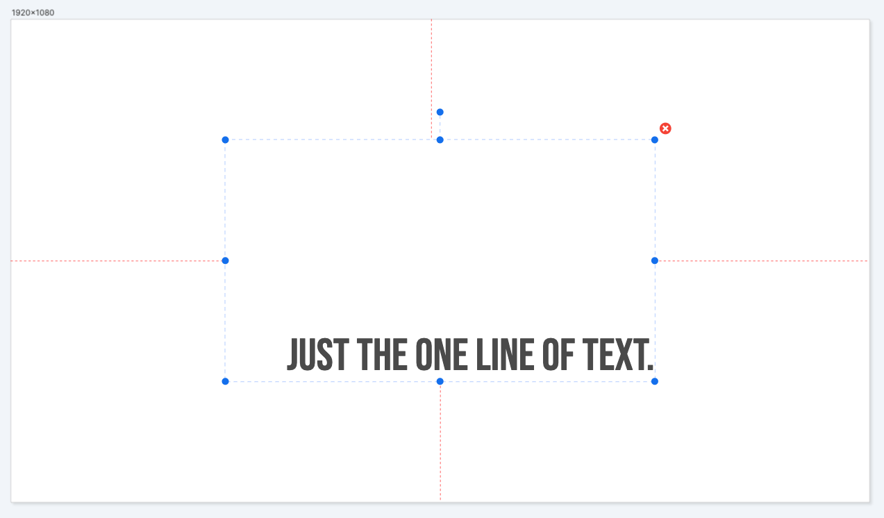
Font Family and Font Size You can use any font that you upload to your Library. Several fonts are available for your to use after you sign-in.
The Font Size property can be specified when Fill Text Box is unchecked. This property is used when the text is not trying to fill the bounding box, giving your precise control over the size of the text regardless of the resolution.
Angle You can rotate text using the Angle property. Specify and angle in degrees.
When Text elements are pinned and an angle is specified, the same rules apply as for other elements.
Here’s an example of a Text element rotated 90 degrees. It has a top and bottom offset of 25 pixels and its height has been set to 250 pixels. 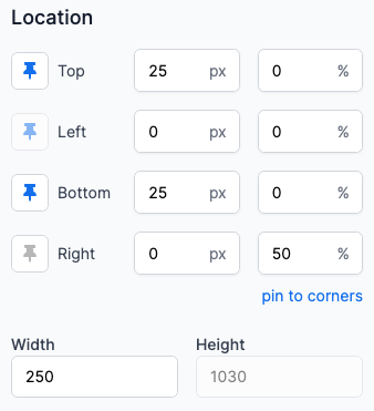

Rectangle elements are simple blocks of a solid color than can be sized and positioned for many uses. 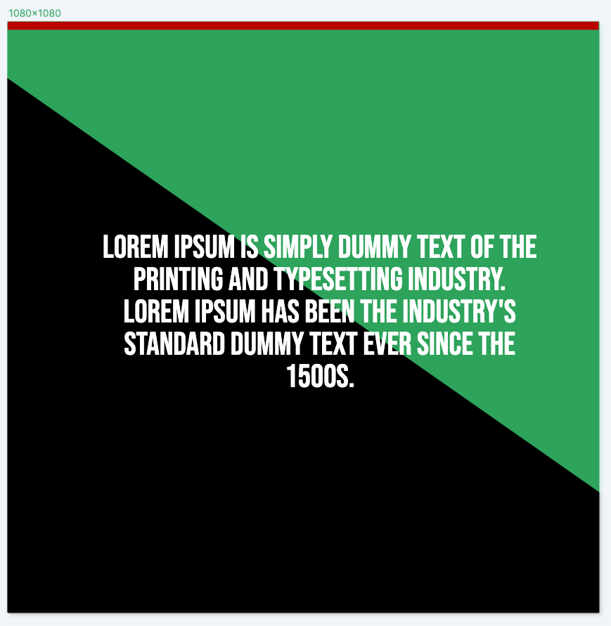
Location and Pinning properties are applied as they are to the other elements.
Angle You can rotate a Rectangle element by specifying an angle in degrees.
Corner Radius You can give a Rectangle element rounded corners using the Corner Radius property. When the Corner Radius is at its maximum value, a square rectangle will appear circular.
Fill Color Change the color of the rectangle using the Fill Color property.
You can reorder how the elements stack in your template using the Elements panel, in the bottom-left corner of the template. 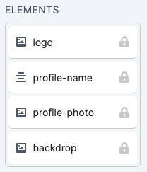
Drag the elements to rearrange their order. Elements at the top of the list appear above other elements in the designer.
Click the padlock icon to prevent changes being made to an element. This is useful if you have, for example, a background image or pattern that you want to lock in place while you work on other elements, and don’t want to inadvertently alter it.
Switchboard Canvas by default will snap to the edges of the template when dragging an element.
Switchboard Canvas also includes a number of shortcuts that speed up the editing of your templates.
When an element is selected, hovering the mouse pointer over another element means you can perform operations using that element as a reference.
For example, the smaller image is currently selected but the mouse pointer is hovering over the larger image. The reference element dotted blue border is shown: 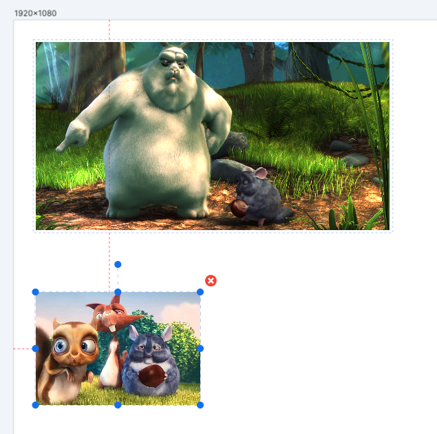
Press A to align the left edge of the selected element to the left edge of the reference element.
Press D to align the right edge of the selected element to the right edge of the reference element.
Press W to align the top edge of the selected element to the top edge of the reference element.
Press S to align the bottom edge of the selected element to the bottom edge of the reference element.
Press SHIFT-W or SHIFT+S to make the height of the selected element the same as the reference element.
Press SHIFT-A or SHIFT+D to make the width of the selected element the same as the reference element.
To remove an element from your template, either click the red cross icon, or select the element and press DELETE.
We care about the protection of your data. Read our Privacy Policy.